

MERKUR Bets
MERKUR Bets
Region
Region
Austria
Austria
Year
Year
2022-2026
2022-2026


The project itself :
MERKUR BETS is a regulated sports betting platform under the MERKUR Group. It offers online and retail betting, including pre-match and live betting, account management, payments, and responsible gambling features. The platform combines fast betting flows with strict compliance and user experience requirements.
Many sports betting websites suffer from the absence of a scalable design system, resulting in inconsistent UI patterns, fragmented components, and inefficient product development. The overall interface often feels outdated, which weakens trust, reduces usability, and makes the product less competitive. In addition, key UX flows such as registration, navigation, betting, deposits, and withdrawals often contain unnecessary friction, creating drop-offs and a less efficient user experience.
The goal was to create a scalable and consistent design system, modernize the overall user interface, and reduce friction across key sportsbook flows. This included improving usability, increasing visual consistency, simplifying complex interactions, and creating a faster, more intuitive betting experience for users.
Senior UX designer building a design system in Figma, improving UI for multiple platforms, including Retail, Online and App. Improving UX flows
conducting research,
storyboarding,
digital wireframing,
iterating on designs,
making high-fidelity prototype
All about the user :
Conducted competitor research across leading sports betting platforms to analyze onboarding, registration, betting flows, bet slip behavior, promotions, account management, and mobile usability. The findings were used to identify UX gaps, market patterns, and opportunities to improve the overall sportsbook experience.
Overcrowded menus, hard-to-find markets, confusing league structures, poor search visibility, and too many steps between finding an event and placing a bet.
Unclear odds changes, overloaded bet slips, confusing stake inputs, hidden errors, slow confirmations, and too much friction before final bet submission.
Limited payment options, unclear fees or limits, slow processing times, failed transactions, confusing verification steps, and poor visibility of transaction status.
It's a structured scheme that outlines a part of the Registration Flows.
One of the core user journeys within the platform is the registration flow, as it represents a critical entry point for user acquisition, onboarding, and compliance.
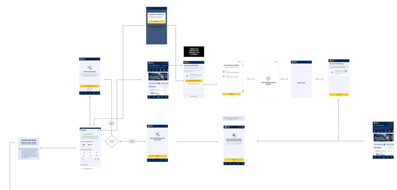
More "clear" version of wireframes in a digital form. Also some of the most important pages are added
in it.
On this step I used the Figma design tool to create digital wireframes of search pages. Then I bonded all of them into the clear and smooth structure.
The goal is to show how all the pages and things interact with each other.

A tokenized design system in Figma is a design system where visual decisions are stored as reusable design tokens, instead of hardcoded values.
Created and maintained a tokenized design system in Figma, using variables, semantic tokens, component properties, and reusable patterns to improve consistency, scalability, theming, and design-to-development handoff.

The clear version :
On this step, first I created a static, high-fidelity web/app design (keeping in mind all the conclusions from the previous phase of usability studies) that is a clear representation of a final product called design mockups.
These are a high-fidelity design that represents the final product
I created all the web/app pages mockups, incorporating the right design elements such as typography, color, and iconography. I also included captivating and visually appealing images, and developed all the necessary components and elements.
The goal was to demonstrate the final product in as much detail as possible.
