


The project itself :
Project Overview
The objective was to migrate from a legacy design platform to a new environment and establish an improved atomic design system in Figma. I successfully completed this transition within 6 months. Following the migration, I also contributed to user flow improvements across multiple branded marketplace platforms, including Bosch and Siemens.
Problem:
Remote customer service teams often face challenges in efficiently managing and responding to incoming service requests due to disjointed communication channels and lack of centralized tools, leading to delayed responses and decreased customer satisfaction.
Goal:
The migration from Axure to Figma aimed to establish a scalable single source of truth, improve product consistency, accelerate design and development workflows, reduce duplicated work, and create a more collaborative, maintainable, and designer–developer-friendly design system.
My role:
UX designer leading the BSH design system migration.
Responsibilities:
conducting research
storyboarding
digital wireframing
usability studies,
iterating on designs,
making high-fidelity prototype
The project schematically :
Starting the Migration
At the start of the migration, we held a series of alignment sessions with key stakeholders to evaluate which parts of the Axure design system were outdated, which required improvement, and which could be migrated without significant changes.
Once the scope and priorities were clearly defined, we used Confluence to document decisions, requirements, and processes, while Jira was used to manage tickets, priorities, and delivery progress. Daily stakeholder stand-ups and clear written requirements helped keep the migration efficient, transparent, and well coordinated.
The initial delivery estimate was six to eight months. I completed the core migration within six months, leaving an additional two months to improve selected checkout flows and enhance features across other brands.
Due to confidentiality and NDA restrictions, I can only share selected parts of the project.
Wireframes and Mockups
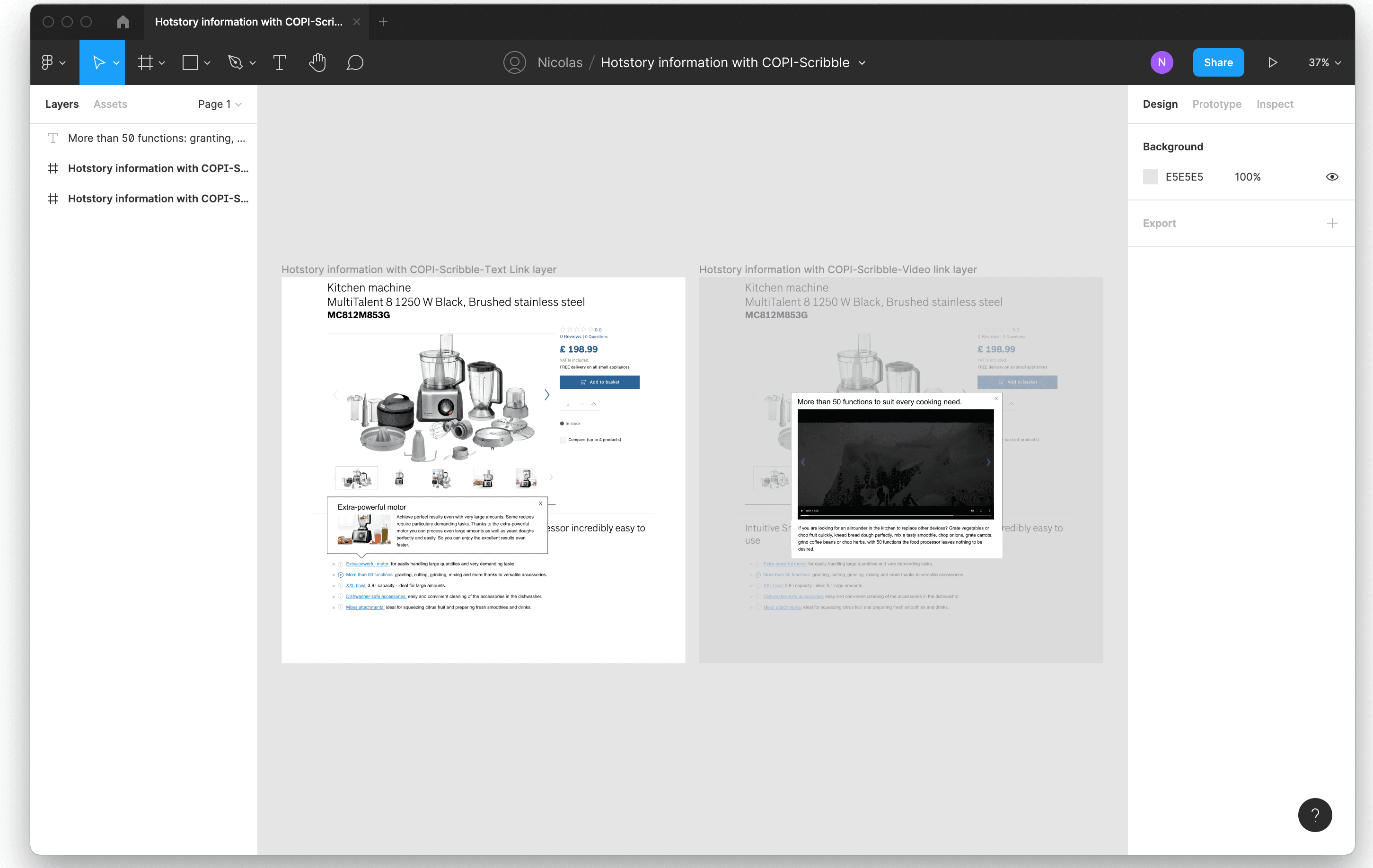
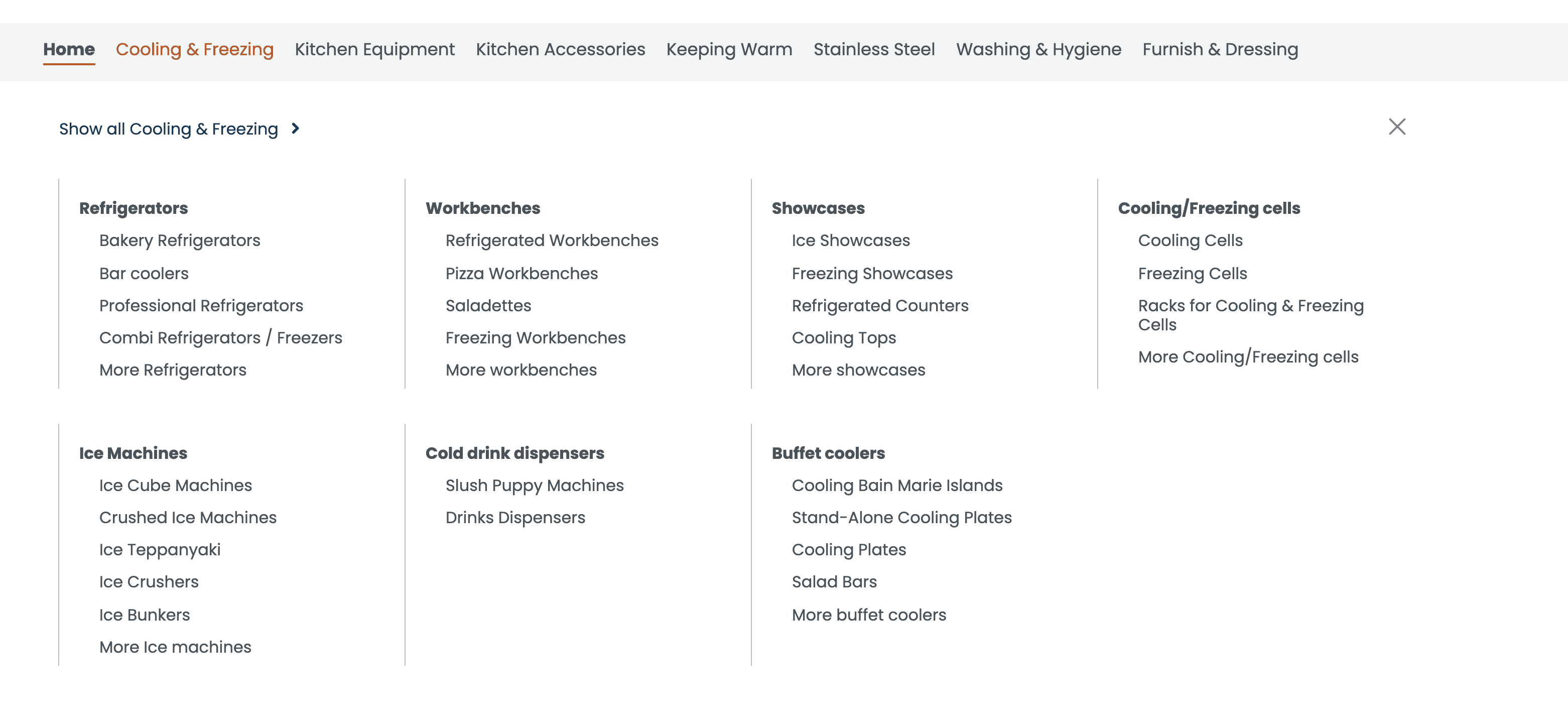
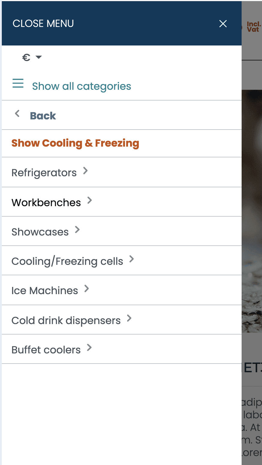
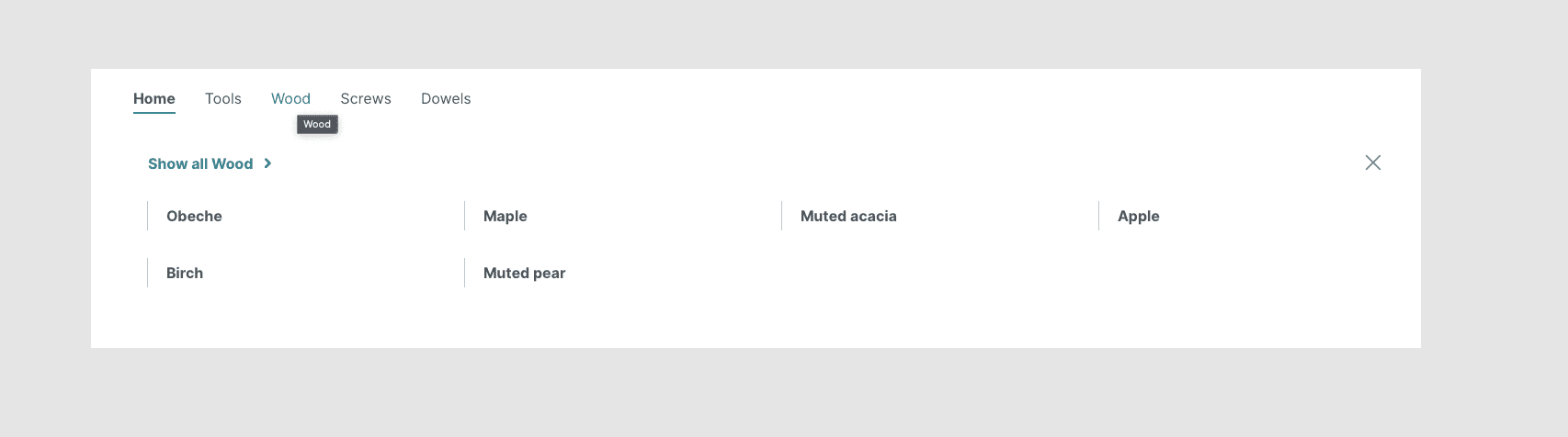
Some wireframes and mockups of pages like product pages, checkout flows, menus and more.
Below is a selection of screenshots from different areas of the project, including wireframes and high-fidelity mockups for product pages, checkout flows, navigation menus, and other key user journeys.







The project schematically :
Outcome
The migration created a scalable single source of truth, improved UI consistency, simplified design-to-development handoff, and reduced duplicated design work. By completing the core migration within six months, we were also able to use the remaining project time to improve checkout flows and selected features across multiple brands.